Redesigned A New Way For Scheduling A Hangout
Hangtight is a social planning app that helps coordinate in-person meetups based on availability and common interests.
1 in 3 Americans Feel Isolated
Individuals are resorting to online dating applications to connect with people and engage in personal relationships. When considering existing apps for making new or improving current connections, only a handful of non-dating functions/apps exist, none of which match people based on IRL activity preferences.
Resolving This Issue
Our team laid the groundwork for a social planning app to coordinate hangouts efficiently through AI-powered recommendations based on compatibility, optimizing mutual timing, and prioritizing preferred places.
Overview
-
Researcher, UX Designer, and Brand Designer
-
Design Internship - 5 Weeks
-
Armando Carvajal (CEO)
Rich Fortune (Cofounder)
Camille Courville
Kaisha Gauderman
Yam Chumpolphaisal
-
Figma, Maze, Slack, Google Meet
-
User Flows, Branding, Style Guide, High Fidelity Wireframes, Usability Testing, Prototype
The Hangup To Hangtight
The business goals were to optimize and redesign the existing high-fidelity wireframes. After reviewing the current screens, it appeared as if integral steps of the UI/UX design process had been neglected. Our biggest challenge was to create organization, structure, and an MVP of user flows that we could all agree on.
Project Plan
We drafted a plan to help us establish a clear roadmap for how we would design, test, and present a solution within a 5-week time frame. Creating an outline was necessary to stay organized, successfully execute each task, and present our weekly deliverables to the Hangtight team.
What Hangtight Aims To Address
We’re In A Friendship Recession
For our target audience, Millennials and GenZers, mental health problems are escalating, personal connections are not, which could be due to a number of factors:
fatigue from back-and-forth coordinating
complex schedules
interest misalignment
social anxieties
forced decision making
Hangtights Target User
Meet Gabe! He enjoys going out and having fun as an outlet from his hectic lifestyle. Recently, he’s faced scheduling issues with his closest friends. He struggles to find mutual times and locations that work for his friend group. He would like to minimize back-and-forth texting and schedule hangouts more efficiently.
Evaluating The User Journey
The previously designed Hangtight screens did not provide us with usable material to build upon. It did, however, give us a base understanding of how the user flows should be reorganized.
Goals For The Redesign
After proposing ideas and discussing the deliverables and outcome with the Hangtight team, we chose to design new screens based on the MVP and most critical user flow (Scheduling A Hangout).
Restructuring User Flows
Through research provided, we found there were 4 primary journeys users would take when scheduling a hangout.
Creating An Authentic & Inspiring Brand Identity
Enhancing the experience by setting the tone of the brand identity
Eggplant - magical, inspiring, and intuitive
Green- symbolizing growth within your inner circle and new beginnings, authentic, trustworthy
Creating relatable illustrations to communicate the brands goals and intentions
Visuals are simple, attractive, and intuitive
Symbolizing meaningful connections
Selecting a font that expressed the brands personality
The font in lowercase is youthful and appeals to our demographic
Increased font size to improve readability
Incorporating ADA accessibility into the design
Color scheme passes ADA compliant contrast levels
Contrast is brighter to emphasize particular content
Users can now clearly read the CTA button
Creating HI-FI Screens That Are Fun, Functional, and Gamified
With four different user flows, each person on the team was responsible for designing a flow and incorporating the visual identity.
Design decisions were made during a meeting with Hangtights team to ensure the wireframes aligned with the project goals while capturing the design aesthetics.
Feedback:
More gamification
Design for light and dark mode
Add a messaging feature (added new user flow)
Gamifying The Scheduling Process
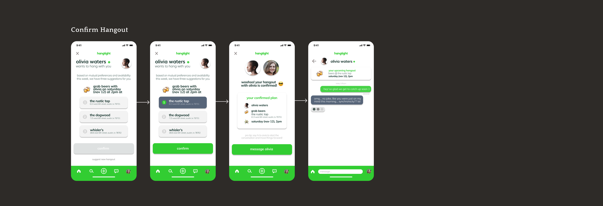
When scheduling a hangout, users can select the friend, activity, date/time, and location or “roll the dice” to randomize the plan.
The request will be sent to their friend who is able to respond by accepting, changing, or declining.
Accepting A Hangout Request
Once a user receives a hangout request, their pending invitation will be added to their home screen.
From here they are able to respond and accept the invitation, if they choose to do so.
The plan will appear as “accepted” on their schedule.
Requesting A Change
If a user receives a request for an activity they aren’t in the mood for, or a date/time that doesn’t work out, they are able to edit the plan and request a change.
All aspects of the hangout can be adjusted except for the friend invited.
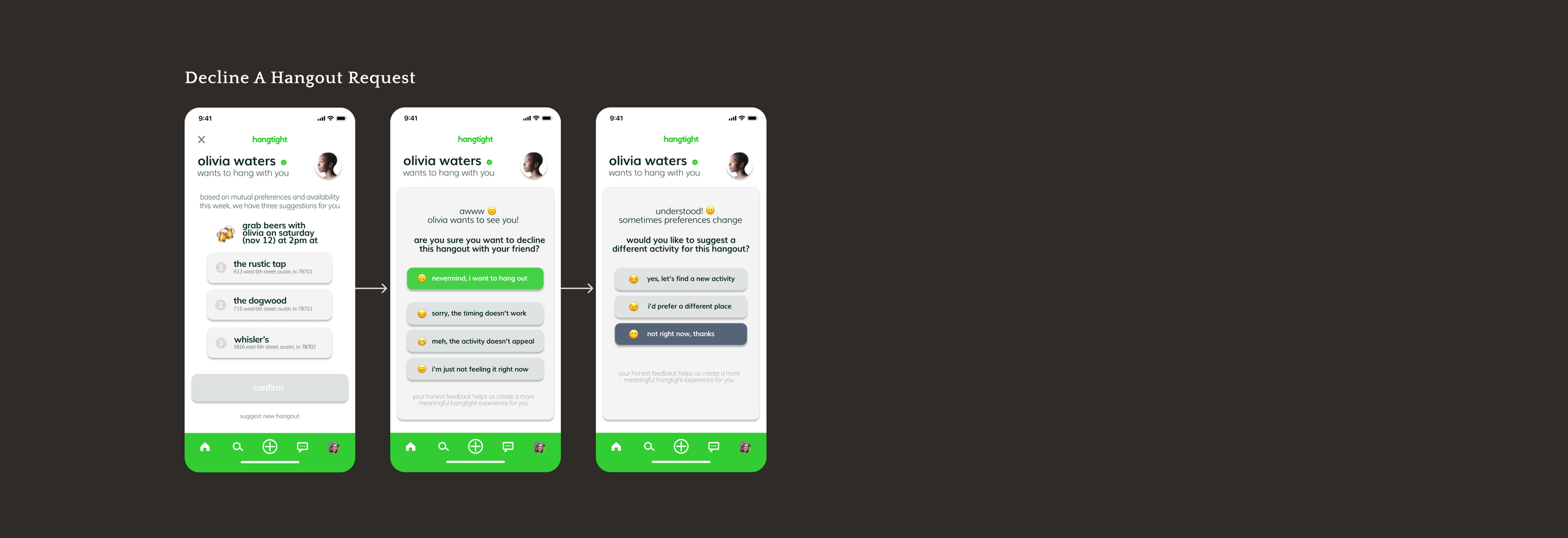
Declining A Request
If a user decides to decline a request, they are asked a follow up question to check in - this adds a friendly and personal feature aligned with the brands personality.
The user can also send a message to their friend with their rejection of the invitation.
Uncovering Usability Issues
We conducted an unmoderated usability test with 5 college students through Maze, to obtain quantitative data, insights from heatmaps, and collect valuable user feedback. We measured key performance indicators (KPIs) to examine both the task success rate and time-on-task.
Objectives: Would people turn to Hangtight to schedule plans with friends, instead of texting? Was it easy to understand? Was the process too long? Were there feelings of rejection and negativity surrounding the declining process on both ends?
Tasks: Schedule a hangout, accept hangout, request a change, decline a request, and message a friend.
Improving The Look & Functionality With 3 Changes
After testing, we redesigned the home screen to reflect the most efficient and condensed format to allow users easy access to their plans.
Instead of using icons to interpret the plan status, we labeled each one to prevent confusion.
Added chat icons so users could easily message their friends regarding the plans made for that day.
Allowing Users To Preview Their Schedules & Hangout Locations
Users clicked through their request to get back to their schedule in an effort to see if the new plan would work with any previously proposed plans they had.
The desire to see how hangouts would line up with each other before confirming is something we had not considered.
We added the ability to preview how the request would fit into users schedules as well as a preview of the location on a map.
This will assist with any time constraints for travel that could hinder any current or proposed plans that the user has.
Removing Multiple Response Screens To Reduce Friction
Initially users had to go through “edit plan” to decline a hangout request.
The flow was far too long for users and many expressed frustration in reaching the point where they could choose to decline.
To reduce user fatigue we added a “decline request” option to the home screen.
Take A Look At The Final Prototype
-
Hangtight was my first design sprint with a team and it was a great learning experience. The sense of camaraderie and collaboration between us made the redesign so enjoyable.
We identified each other’s strengths and weaknesses early on. This helped us divide and conquer our responsibilities and deliverables.
Working within an agile environment made me appreciate our weekly design meetings.
We learned how to be concise with the topics we needed to discuss with the CEO/Co Founders, but we still had the flexibility to go off-topic when necessary. A fun team inspires creativity and involvement.
-
The product that we started with was not usable or accessible and didn’t have a logical flow. We focused on solving coordination fatigue, complex scheduling, and interest misalignment. Now, the newly designed flows allow users to schedule a hangout without conflict.
-
Following the project scope and timeline, we only conducted 1 round of usability testing and delivered iterations based off the feedback we received. Hangtight will need a 2nd round of usability testing to validate those changes.
Other suggestions:
Optimize the onboarding process and redesign the high-fidelity screens with our updated user flow
Enhance the scheduling flow, depending on what is obtainable from AI, incorporating Google Maps
A/B testing for light mode vs dark mode

Next Project
Let’s work together.
Feel free to reach out if you need a hand with your project or want to chat about design.


