Optimizing The Browsing And Checkout Experience For An Online Bike Retailer
Odyssey Bikes sells reliable, versatile, and well-crafted bikes. The company caters to serious enthusiasts who are willing to invest in premium products.
What Needs To Be Solved
Lately, the company has noticed usability issues and would like to enhance its browsing and checkout experience for customers purchasing on its web platform.
The Solution
Create an engaging and effortless shopping experience for bike enthusiasts to quickly find the perfect cycle, receive expert advice, and purchase it through a seamless guest check-out process without creating an account.
Overview
-
Researcher, UI/UX Designer
-
Academic — 4 Weeks
-
Competitive Analysis, Surveys & Personas, User Stories & Flows, Brand Identity, Wireframes, Usability Testing & Iterations, Prototypes
-
Figma, Miro, Maze, Overflow
Project Plan
Before any research, I drafted a project plan to help me establish a clear roadmap for how I would approach this task within a 90 hr time frame. Creating an outline was necessary to identify my desired goals, stay organized, and successfully execute each deliverable.
The Importance Of Knowing What You Don’t Know
Along with data provided from the company, I conducted my own research for this project to facilitate a better understanding of e-commerce and the bicycle industry.
Impactful E-Commerce Stats
How Competitors Tackle Similar Issues
Common Key Features For A Successful Checkout
Most People Don’t Buy Bikes Online
Primary research was conducted through a short survey to evaluate biking enthusiasts experiences when using online platforms to shop for their next bike. Asking 17 participants a series of 10 questions, I was able to identify major frustrations and pain points within typical purchasing experiences.
User Non-Negotiables
The Ideal User
Meet Ethan! My target user who bikes weekly. He pours hours into online research before making a purchase decision. His main priority is to receive expert advice on a bike that matches his measurements exactly, possibly test ride, and purchase the bike for an overall better value online.
How Do We Make People Feel Secure When Buying A Bike?
I redefined the problem statement into four HMW questions. These questions helped me generate new ideas and solutions.
Producing A Minimum Viable Product (MVP)
I created a set of user stories to define the site’s functionalities. As a result, I produced an MVP:
Creating an engaging and effortless shopping experience for bike enthusiasts to quickly find the perfect cycle, have the option to talk to a specialist and purchase it through a seamless guest check-out process without the need to create an account.
Ideating A Solution
After identifying my main tasks, I developed a user flow to showcase the various paths a user will take to accomplish their goals. Because of time constraints, I only made one flow to solve for multiple problems. Future iterations may require additional flows.
Find the right bike by taking a quiz
Talk to an expert
Check out as a guest to purchase a bike
Skipping Sketches & Creating The First Wireflow In Mid-Fidelity
The wireframes were intended to be relative to the overall look and feel of other e-commerce websites. The product and context were showcased through eye-catching detailed descriptions, and engaging visuals in order to capture the users attention.
Uncovering Usability Issues
For the 1st round, I conducted moderated testing on 5 cycling enthusiasts. Using the mid-fidelity wireframes, the tasks given were: Find a bike, receive expert advice for the correct size, and purchase using guest checkout.
Iterating The Design
Based on the test results from round 1, I kept the site's main features the same since 5/5 participants were able to successfully complete each task. However, I did iterate a few minor issues before conducting round 2 of user testing.
A Savvy & Dependable Identity
I searched for inspiration and created a mood board that reflected these words. The imagery chosen displayed bikers riding in total confidence to mirror the brand’s personality.
Logo Development
For the company name, I explored words that demonstrated a bike journey. The two finalists were "Expedition" and "Odyssey." Both embodied the idea of an eventful and adventurous journey.
However, the name "Expedition" felt as if the company was solely exclusive to selling specialized touring bikes, so I moved forward with the name "Odyssey."
Typography & Color Palette
I designed the UI in a dark theme to emphasize the visuals and context. In addition, I added orange accents and rounded corners to give the site a modern and approachable feel. Orange, representing power and seriousness is associated with open space, and freedom which reflects the brand’s image.
Creating A Website That Felt Sophisticated & State-Of-The-Art
Using the iterations from the mid-fidelity prototype and incorporating the visual identity, I could finally construct the high-fidelity screens.
Improving The Completion Rate From 30% To 100%
For the 2nd round of usability testing, I focused on measuring key performance indicators (KPIs) to examine both the (TSR) and (TOT).
I implemented the Single Ease Question (SEQ) method, which allowed me to see on a 7-point scale how difficult the task was for the user to complete.
I ran an unmoderated usability test with 5 new participants through Maze to obtain quantitative data, insights from heatmaps, and collect valuable user feedback.
The tasks given were the same as the initial test: Find a bike, receive expert advice for the correct size, and purchase using guest checkout.
5/5 participants were able to complete each task successfully which improved Odyssey Bike’s completion rate from 30% to 100%. Even though the website yielded high usability rates, there were still minor issues to fix based on the feedback I received.
Improving The Look & Functionality With 3 Changes
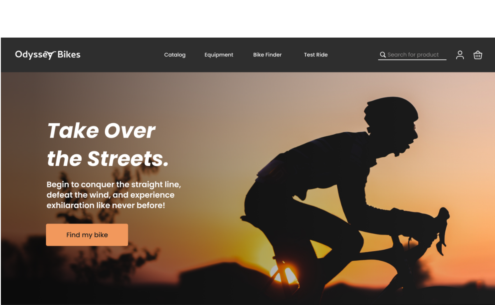
I implemented 3 significant changes to the website. First, I made changes to the Homepage; the square container behind the text felt too heavy on the eyes. Also, I realized the text in black should be white, and my CTA button wasn't the correct color either.
Chatting With An Expert While Scrolling
Next, users wished the messaging feature would appear at the top of the page instead of bringing them down to the bottom. I iterated the chat box to a fixed position so users could have more control over their experience. Now, users can access the specialist while scrolling and reading through all the product features.
Adding Text Labels To Reduce Error
Lastly, the placeholder text disappeared every time a user entered their information. With missing labels, my users could not verify their information before going to the next screen.
I updated the text field with an outlined version. The new text labels informed users what the requested details for that text field should be, reducing user error and creating a better checkout process.
Take A Look At The Final Prototype
-
I am incredibly proud of the product I developed in under four weeks. Odyssey Bikes challenged me to solve multiple problems through research, iteration, and testing while sticking to a 90-hour time constraint.
At the beginning of the project, I knew nothing about e-commerce or effective web design since I previously only worked on mobile apps. To obtain a better understanding, I immersed myself in e-commerce research and effective design strategies before attempting to ideate solutions. Through multiple rounds of ideation, I learned how to meet user and business needs.
-
For the UI, scannability and readability were crucial in creating a compelling user experience. I found the best readability depended on the weight of the typeface and the contrast between different shades of dark grey and light colors. I asked myself:
"What's the best background color for the website?"
"How do I illuminate the background images so the bikes stand out?"
"Will this shade of orange pass accessibility standards?"
I gained a valuable skill set and can now achieve dark UI designs for future projects.
-
There are still more features to be made including the creation of a mobile version, a bike comparison chart, and a calendar for guests to schedule a test ride.

Next Project
Let’s work together.
Feel free to reach out if you need a hand with your project or want to chat about design.


