5-Day Design Sprint
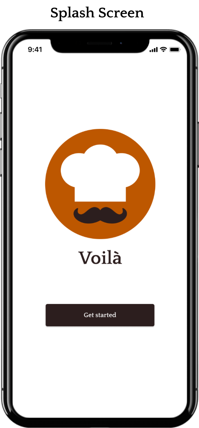
Voilà is a fictional mobile app that features a variety of high-quality recipes for people who like to cook at-home and a cooking community that enjoys rating and reviewing recipes.
The Problem
Lately, the Voilà platform has received a handful of negative reviews regarding their difficult-to-follow recipes. As a result, users cannot prepare some of Voilàs’ more complex dishes.
Design constraints in the challenge included:
A daily deliverable
A restricted number of screens for the storyboard and prototype
Overview
-
Researcher, and UI/UX Designer
-
Academic - 5 Days
-
Synthesizing Research Data, Solution Mapping, Sketching & Storyboarding, Prototyping, Usability Testing
-
Pen & Paper, Figma
To Help Voilà Solve The Problem
I focused on creating a better cooking experience for users by simplifying complex recipes with step-by-step instructions to prioritize efficient prep work and time management.
Day 1
Discovering Culinary Challenges Within The App
The 1st day of the design sprint was spent reviewing the challenge brief and understanding the problem. I was provided with an audio recording, quotes from other user interviews, and a persona.
Identifying Concerns From The Interviewees
After collecting interview data, I formed an affinity map. This process helped me formulate a better understanding of the user's pain points.
Imagining How The User Would Complete The Journey
Based on the insights gathered from research, I mapped out the users' end goal:
Accurately prepare and cook a dish by easily following the cooking instructions.
This exercise helped me understand and discover each step the user would take to have a simple and enjoyable cooking experience.
Day 2: Solution Sketching
How Competitors Tackle Similar Issues
To gather inspiration for my solution, I began researching Voilàs' competitors:
I downloaded and demoed NYT Cooking, Tasty, and Kitchen Stories to see how each app formatted its recipes.
I took screenshots and compared the different functionalities of each app.
I documented notes about the UI design and what features were captivating.
Rapid Sketching - 8 Ideas In 8 Mins
I pushed myself to think outside the box by implementing rapid sketching for the most critical screen,“The Recipe Overview” screen.
Key elements:
The recipe title, the level of difficulty, the complete time frame of the dish, the calories, the serving size, the reviews, and a brief summary of the dish.
Option to "favorite" the recipe card.
The breakdown of the recipe in 4 simple steps.
Ideating The Recipe Sequence
Using sketch #5 as the foundation, I drew a 3-panel solution board which included (the critical screen and the screens that would appear before and after). This technique gave me an idea of what the recipe sequence would look like for users going through the flow.
Before Critical Screen
(Home)
Critical Screen
(Recipe Overview)
After Critical Screen
(Gather Cookware)
The Sequence In 3 Steps
Day 3: Storyboarding
Illustrating A Storyboard Of The Cooking Process
Building upon the 3-panel board, I started to dive into the big picture of how the app flows.
As a result, I expanded the flow to an 8-panel storyboard that mapped out each step of the cooking process. It was necessary to give the users various ways to learn a new recipe and have the flexibility to navigate their cooking experience.
Based on skill level and individual needs, users can select to learn the recipe through written step-by-step instructions or with a cooking guide involving audio instructions and videos.
Day 4: Prototyping
Designing The High-Fidelity Screens In 1-Day
I kept the UI simple and incorporated the brand colors provided. Then, I built the screens into a clickable prototype to test with users the next day.


Day 5: Validating the Design
Testing At-Home Chefs With Different Skill Levels
On the final day, I conducted usability testing via zoom with 5 participants between the ages of 20-65 to see if the design was usable and intuitive. All participants were enthusiastic at-home chefs with different skill levels. During testing, participants were asked to follow a recipe as if they were preparing it at that time.
5/5 Testers Completed the Task
I watched each user's interaction with the app and observed if they could complete the main red route: accurately prepare and cook a dish by easily following the cooking instructions.
5/5 testers completed the task and were satisfied with the layout of the recipe page. I noted features that users liked and made a list of things that could improve the user experience.
Positive User Feedback
Recommended Iterations
Take A Look At The Final Prototype
Final Thoughts
Reflecting On The Sprint
This project gave me a concrete understanding of the design sprint workflow and helped me learn to work within lean and agile UX frameworks.
The fast-paced daily structure kept me disciplined and encouraged more creativity in my brainstorming sessions since there was pressure to find potential solutions quickly.
The speedy process made me wish I could have worked with a team, as it would have been fun to bounce around ideas and build on them together.
Next Project
Let’s work together.
Feel free to reach out if you need a hand with your project or want to chat about design.


